Use geomaps to display data by geographic region in a map format.
Important: Geomaps experience reduced performance and respond slowly when users plot a large number of data points. Geomaps are best suited for highly aggregated data and fewer than 500 data points. Individual results can also vary based on the available resources of the computer used to run the client. To avoid performance issues, plot a small number of data points and increase the number of data points incrementally.
Topics on This Page
Create a Geomap
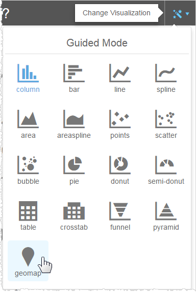
- In the Guided Mode menu, select geomap.
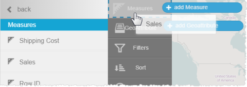
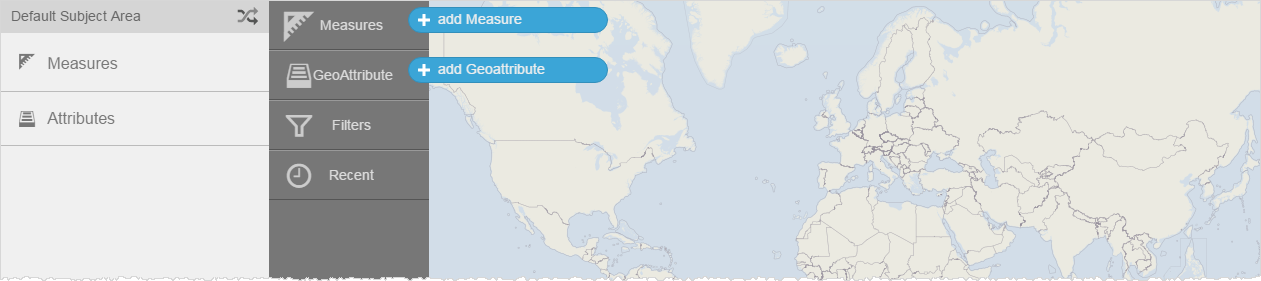
The default map displays and Visualizer prompts you to add a measure and a geoattribute.

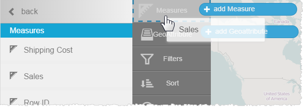
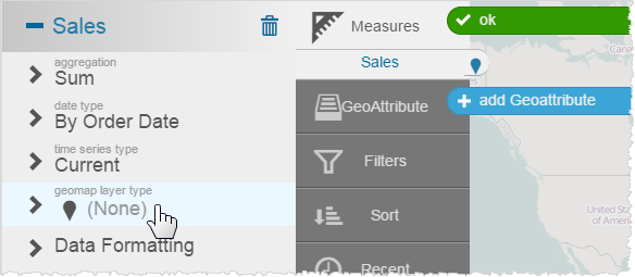
- Add a measure.
- Set the geomap layer type for the measure.
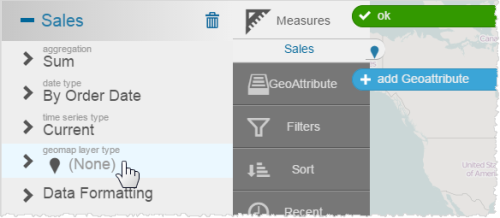
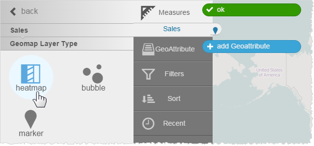
- Select a layer type.
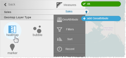
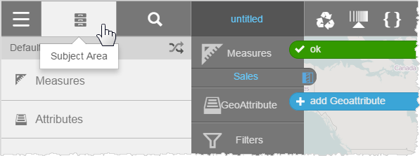
- Click Subject Area. The measure in the Chart Builder shows the heatmap icon.
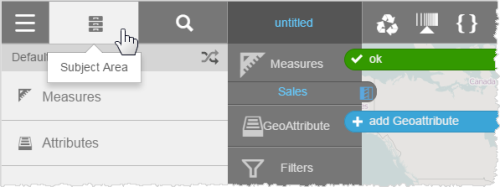
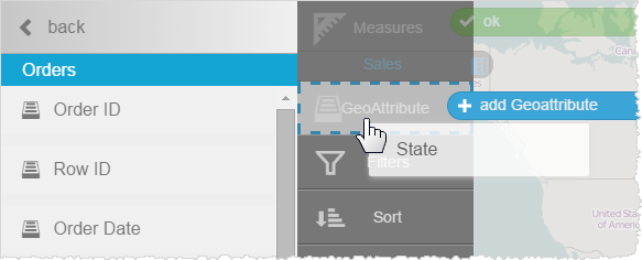
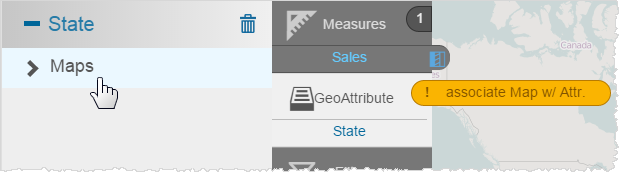
- Add a geoattribute.
Visualizer prompts you to associate a map with the attribute.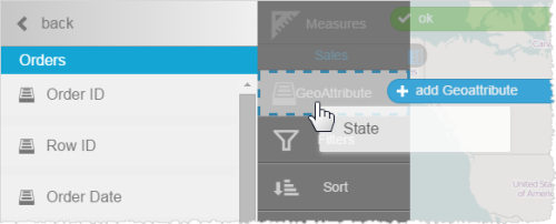
- Click State.
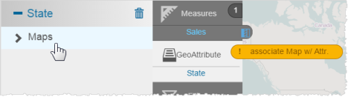
- Click Maps, then select a map.
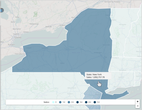
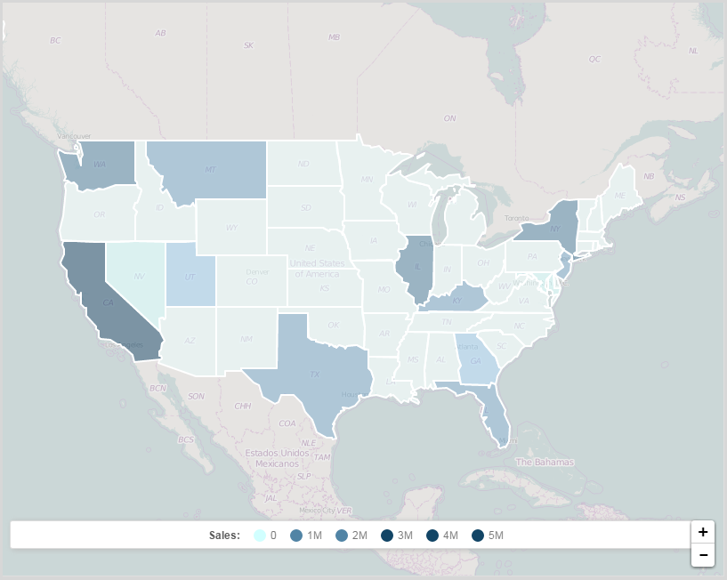
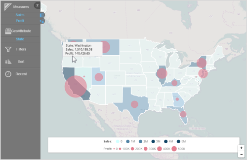
Visualizer applies the measure and the state attribute data to a heatmap.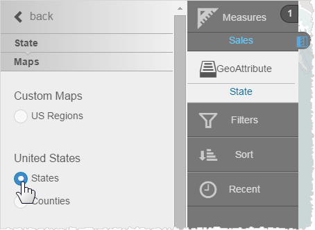

- Hover over the map to see the data. Click a state to zoom. Use the zoom controls to resize the heatmap.

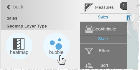
Change the Layer Type
- Click a measure in the Chart Builder column.
- In the measure's properties, click Geomap Layer Type.
- Select another map style.
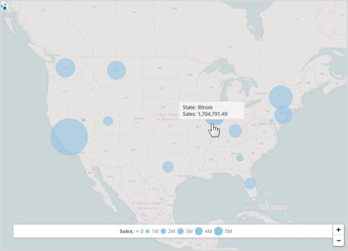
Visualizer applies the new layer type.

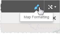
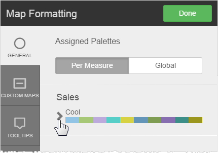
Change the Colors
- Click Map Formatting.
- In the pop-up, click the arrow next to the current palette.
- Select a different palette.
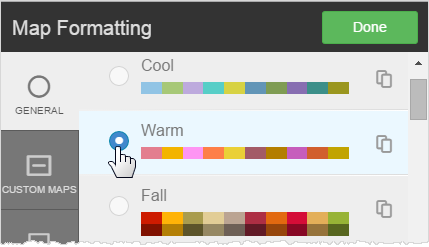 Tip: You can create and use a custom palette for your company.
 - Click Done.
Format Tooltips
Like other types of reports, you can apply tooltip formatting to geomaps.
- Click Map Formatting.
- Click Tooltips.
- Change any of the following, if needed:
- Text formatting
- Unit formats or percentage
- Suffix
- Decimal precision
- Currency symbol
- Click Done.
Save a Default Zoom Level
When you save a geomap, Visualizer retains its zoom level. You can set up a default map area based on a built-in map from which users can zoom in or out.
- Use the zoom control and move the map to the area you want to use as the default map.
- Save the geomap.
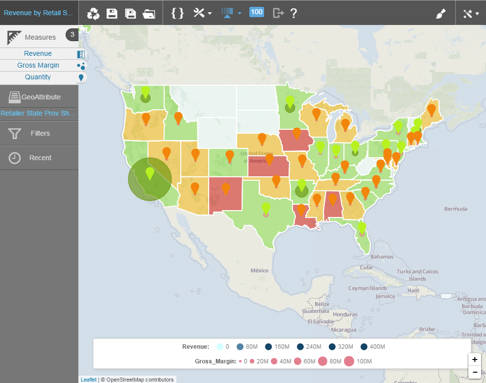
Overlay Measures With Layer Types
You can display one measure as a heatmap, another measure as a bubble map, and a third measure as a marker.
- Add a second measure to an existing map.
- Select the alternate chart type. Visualizer displays the two measures in two different chart layer styles.

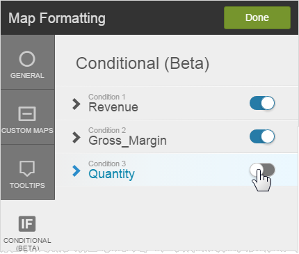
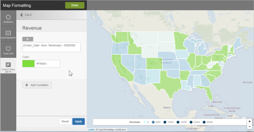
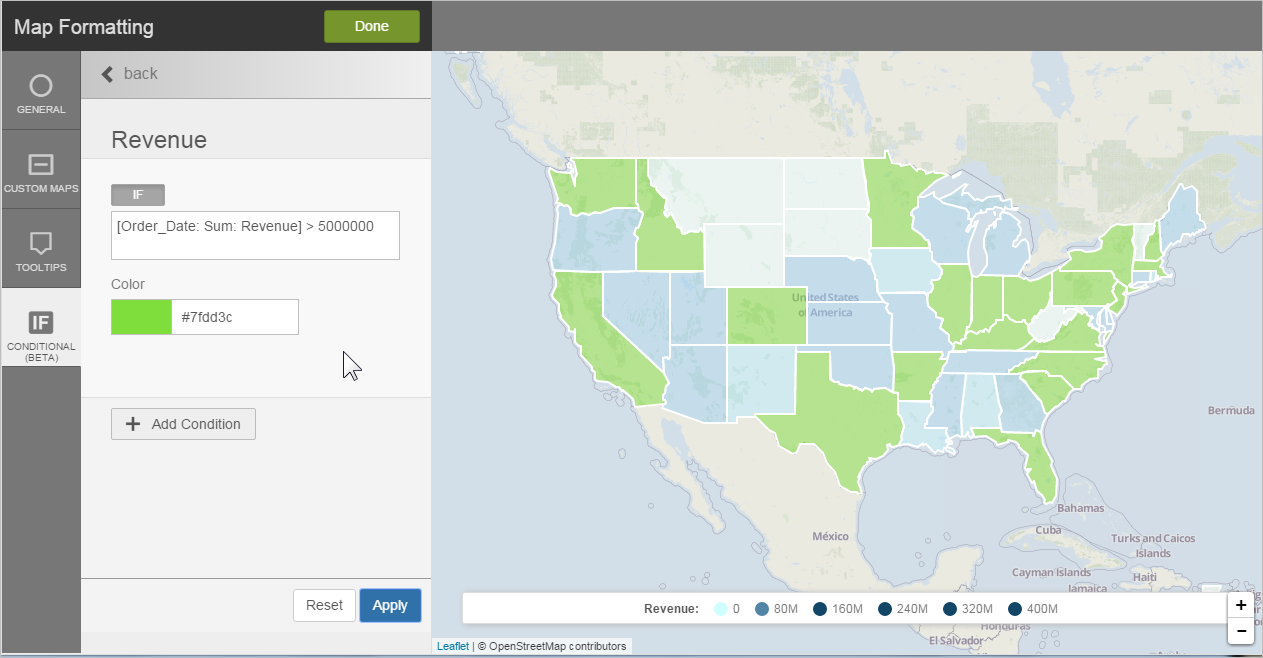
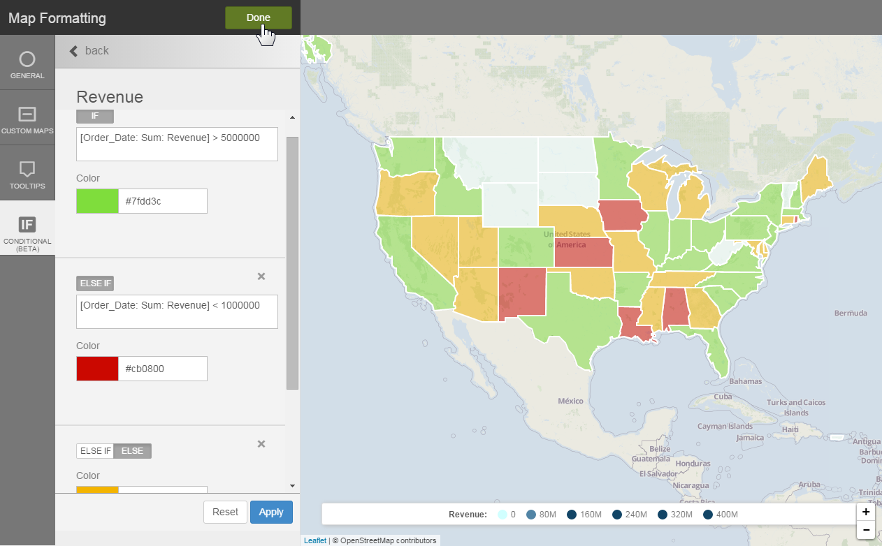
Apply Conditional Formatting to Layers
You can apply conditional formatting to geomaps using BQL![]() Business Query Language IF/ELSE syntax and color. This applies to any layer type.
Business Query Language IF/ELSE syntax and color. This applies to any layer type.
- Click Map Formatting.
- Click Conditional.
- Select the measure.
- Type the BQL expression for the condition. Tip: The BQL
 Business Query Language expression can be any expression that you want and it does not have to include the measure of the layer.
 - Select the color to apply when the condition is met.
- Click Apply to preview the geomap conditional formatting.
- Optionally, add another condition.

- Click Done.
Tip: Overlay measures and apply conditional formatting to each measure for a more interesting visualization.
Tip: You can enable and disable conditional formatting by clicking Map Formatting → Conditional.